Share
How to Start a Photo Magazine in a Pandemic
The past few decades have been unkind to photo magazines. Many industry stalwarts have gone defunct, while others have moved to online editions onl...
The past few decades have been unkind to photo magazines. Many industry stalwarts have gone defunct, while others have moved to online editions only. Ironically, many photographers still believe in the photographic print, even though they might contend that the vast majority of image consumption happens on mobile devices.
In January, I chatted with renown photojournalist Kenneth Jarecke who had just announced the creation of The Curious Society, a large format photo magazine featuring the work of some of the world’s best photojournalists and documentary photographers. The goal wasn’t only to publish a visual tour de force on a quarterly basis, but to also pay photographers a traditional space rate that made producing such work economically viable.
This month, the first issue started shipping, and it is beautiful. Jarecke went from concept to design to printing and shipping in under six months. I reached out to him again to understand the logistics behind The Curious Society, and yes, if you love photography, you should subscribe.
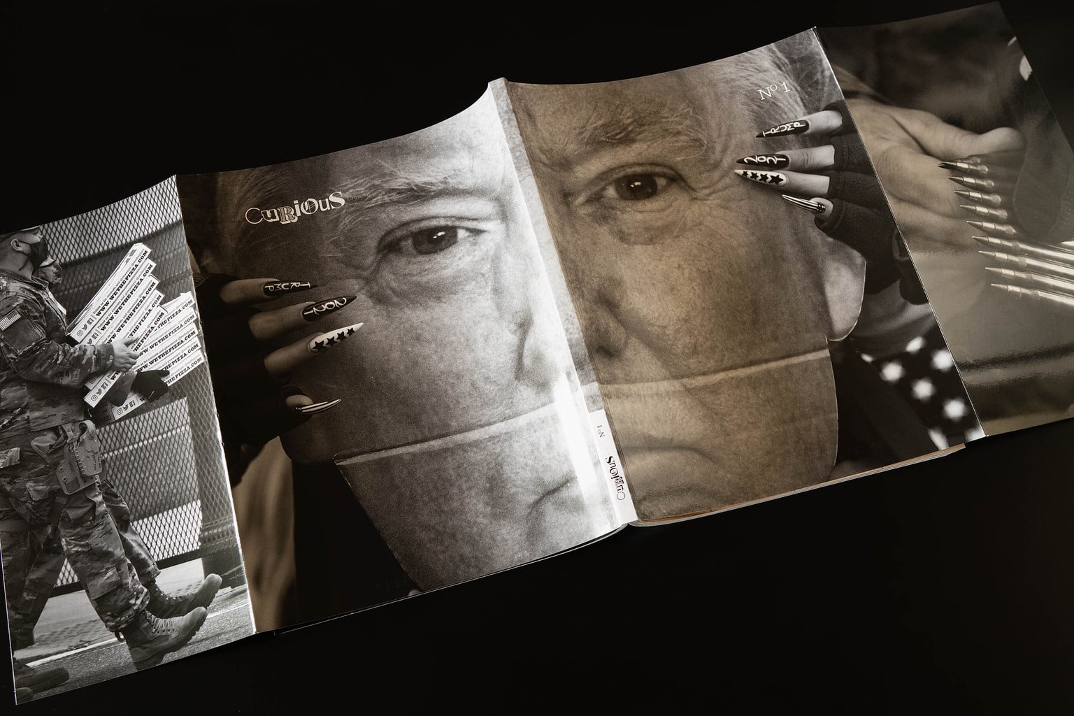
Wrap around cover shot by Carol Guzy of Issue One of The Curious Society publication from her January 6th coverage at the US Capitol. Guzy shot the flaps as well.
All images Copyright 2021 Kenneth Jarecke
How collaborative was the editing and design process? (e.g. who made the call for cover art? How did you decide on whether to go full bleed or borders?)
The amazing talent of both our editorial staff and contributors is our greatest strength. Our photo editors, May-Ying Lam and Natalie Behring and our Content Director Paul Bellinger are responsible for all of the images in issue one. They went through the 480 submissions (or so) we received from across the globe and presented the best to me. I’d guess, they showed about 15% of all the work. They did the hard part. All I had to do was figure out how to fit all of this remarkable work onto our pages.
The design of the magazine was done by Mimi Boneta and Alex Garcia of Tippit & Moo. It’s based on a classic six column structure, so we’re working with a solid architecture and (more or less) fixed layout rules to follow. The initial layout was done by our in-house designer, Hannah Lode, myself and Paul. With that done, we worked with Alex to polish it up… if you can call three weeks of hard work a polish. The idea was/is to have Alex work closely with our team to teach them how to speak the language of the design he created for us. He’ll be very hands-on for issue two as well. After that, we should have a pretty good handle on things from a design perspective.
Our staff and contributors are responsible for everything that’s right and brilliant in our first issue. Everything else is my fault.
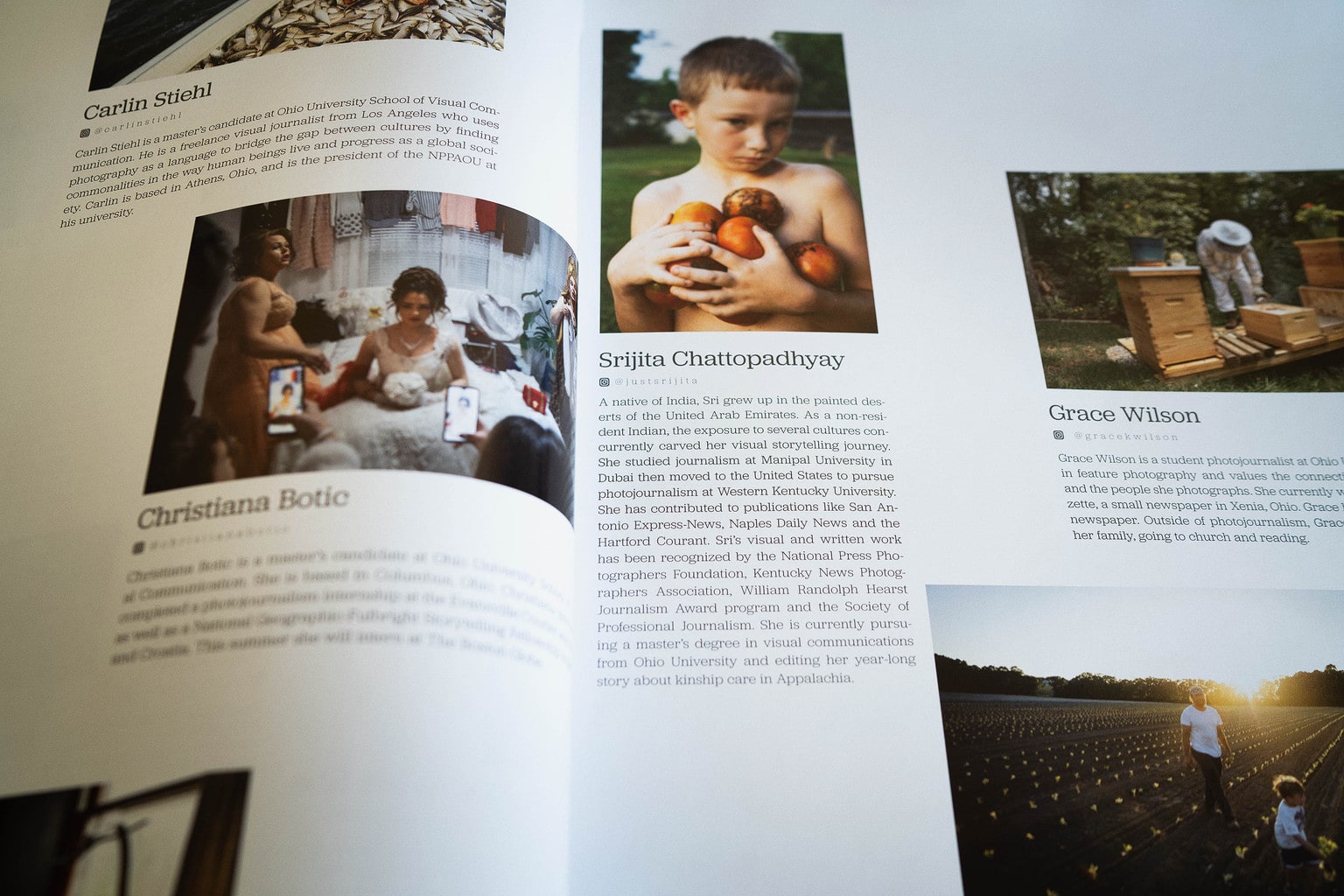
I didn’t ask for much feedback on the cover. There was no market research. I didn’t show it to the board of directors.
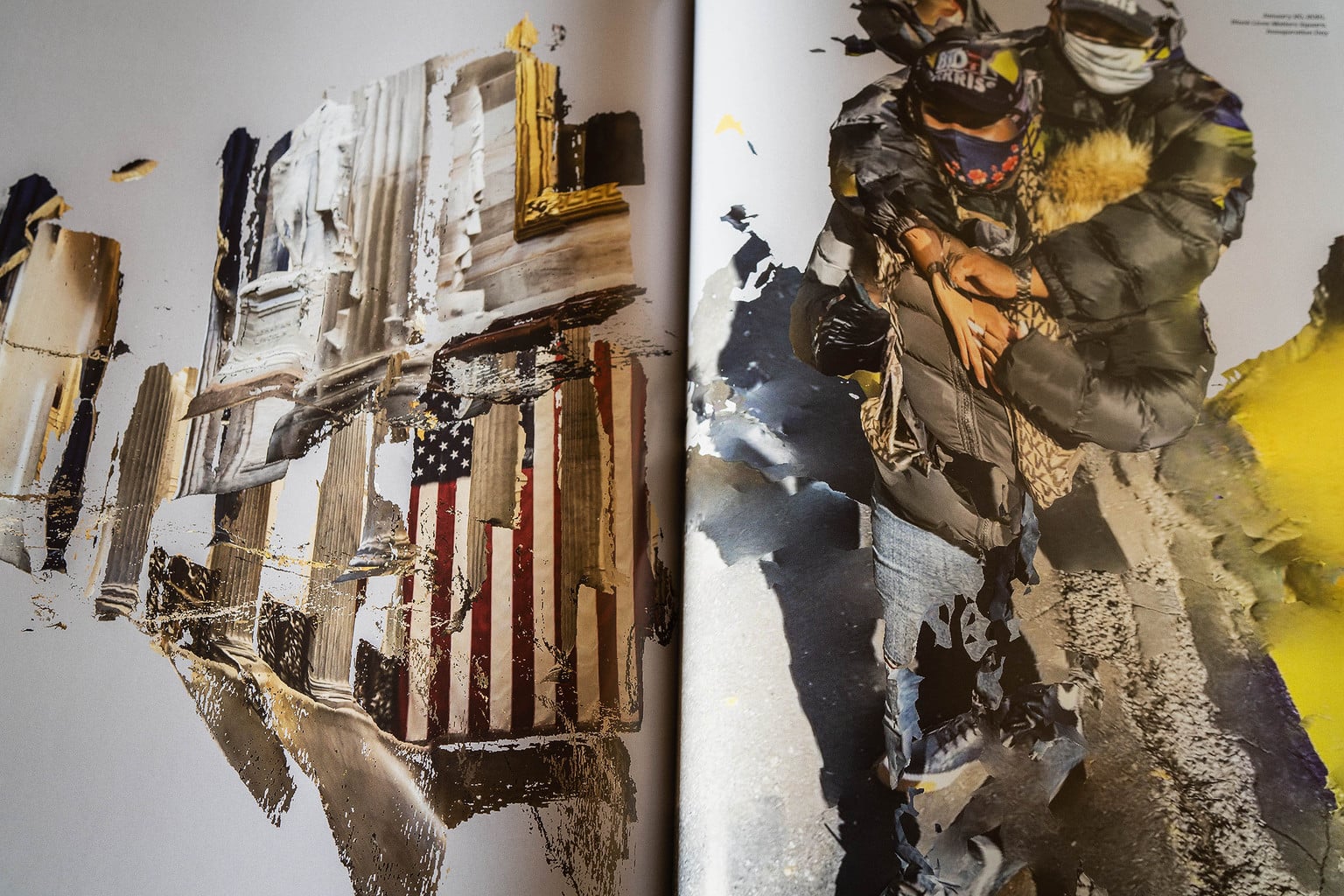
From a journalistic standpoint January 6th can’t be ignored. Knowing that the magazine wouldn’t arrive until a good six months after the event we needed to have a unique approach. With the flaps, our cover is designed to be a mini photo essay in itself. Carol Guzy’s images worked brilliantly in this regard. They are very traditional, black and white, but also very insightful. We set the stage with her images. They document the event, but also give members a hint of what our publication is all about. Having done that, in the body of the magazine we ran twenty-two pages of Chris Morris’ images from the same event. They are the opposite of Carol’s work, as he captured them with lidar from his iPhone 12.
(It’s important to say that the January 6th event is what’s important, not how we chose to cover it, but we’re sharing insight into our process here which I think your readers will appreciate.)
Our primary goal was to provide meaningful insight into the event. The secondary goal, as a publication, was to do it in a way that no other publication could or would. Having achieved these goals, my hope is that our readers will also see that The Curious Society is both completely rooted in our traditional photojournalistic principles, while at the same time being open to new ways of practicing our craft.
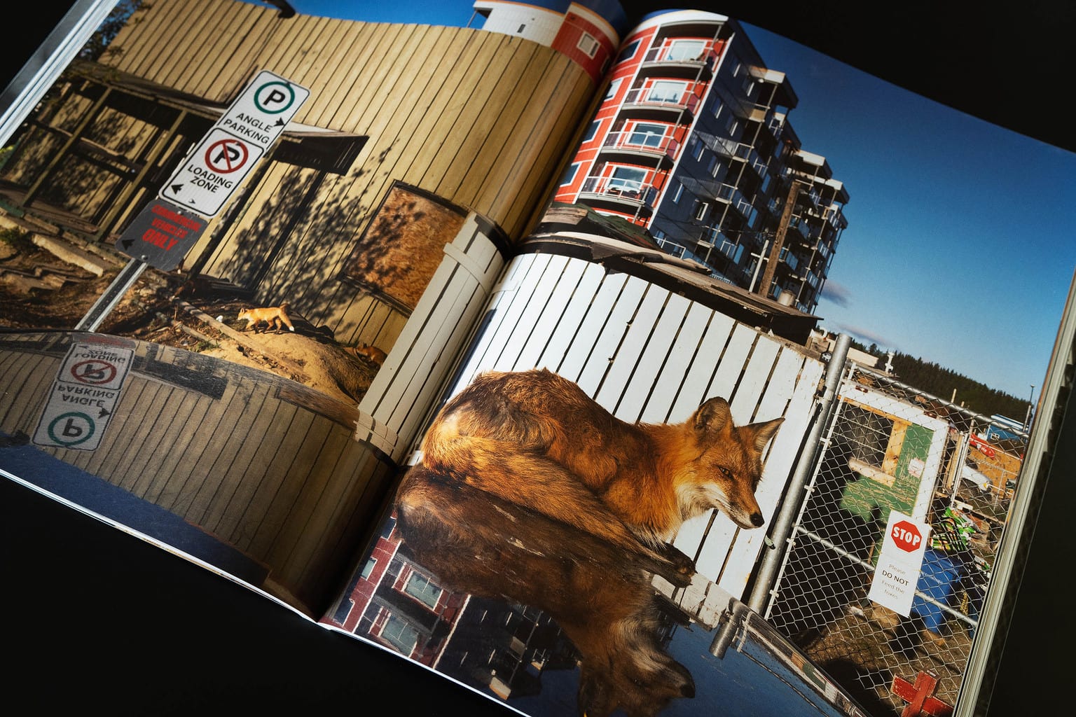
Publishing costs and complexity go up with page size. How did you determine the final dimensions of the magazine?
The goal was to deliver a tactile experience to the viewer as far removed from an iPhone, newspaper or normal magazine as we could. The idea was to immediately engage the viewer’s brain by having them interface with an object that is somewhat familiar but also not. So the weight, texture, size… all was a deliberate attempt to knock the user out of their comfort zone. Our aim is to start conversations with the images, but to do that we need to get the viewers/readers attention first.
Additionally, we want to deliver photojournalism in the most ideal way outside of the walls of a museum. We want to create that experience, for no other reason than our readers, our contributors and the people who’s stories we are sharing on our pages, deserve it.
With those goals in mind, all we needed to do is find the sweet spot between a 3:2 horizontal aspect ratio, press capabilities, paper size, big versus too big and the amount of money we were willing to spend on each unit.
Did you consider using more consumer-end publishing options like MagCloud or Blurb?
Absolutely not.
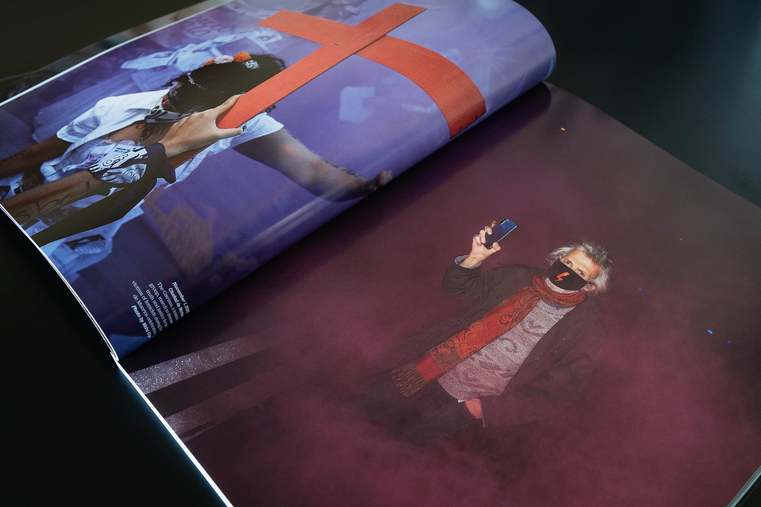
Many photo books are published in Hong Kong, China and Italy. Was it cost-prohibitive to consider a USA-based vendor? Were there other factors that led you to your print vendor selection?
Due to real issues with censorship, we didn’t consider China or Hong Kong as that would put us in jeopardy of having our publication not get printed, or worse, printed, paid for and not delivered.
We were determined (or at least hoping) to work with NAVA, as they’ve produced some of our favorite titles over the years. We were also determined to print in the States. At the end of the day, we couldn’t afford to print on one of NAVA’s US based operations and went with their press in Milan. We traded about six weeks of time (sea freight) for the lower production costs of Italy.
As you know, Embassy Graphics is one of the most respected names in the proofing game, plus they have an extreme amount of patience when dealing with novice publishers like myself, so working with them was both a no-brainer and a blessing.
For those who aren’t familiar with the printing process, can you clarify the responsibilities of the proof vendor (Embassy Graphics) and your printing vendor (NAVA Press)?
The proofer makes any needed corrections to the image files in order to make them look on paper like they look on your screen (minus the smaller color gamut of print). So Embassy Graphics, working in Winnipeg, prints the proofs out on a printer synced up to NAVA’s specs in Milan. They ship those back to me in Montana and eventually to Milan as well. The proofer certifies to the printer that the image files will produce the desired result. The proofs are the visual roadmap that we all use for what comes off the press. We budgeted for three rounds of proofs for issue one, and we used all three.
I assume you went into the publishing process with a series of must-haves and nice-to-haves. Can you articulate what some of those were, and how they shifted as you learned about different technologies, paper stocks, and printing costs?
There were really only two changes. Originally I wanted the cover flaps to be the same size as a full page. We weren’t able to do that, but they still turned out well. The only other thing was that we had originally planned to have a smyth sewn binding, but NAVA assured me the glue would work better and be just as sturdy… and they were right. Which is another reason to go with an extraordinary printer.
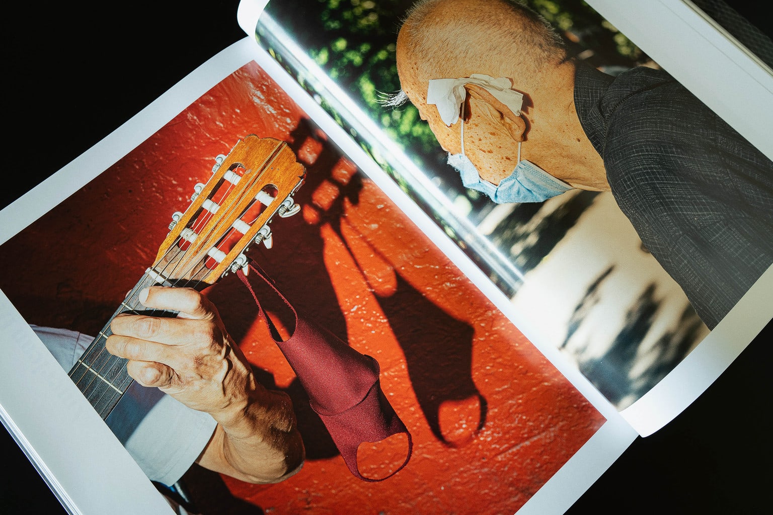
COVID restrictions prevented you from visiting the printing press and proofing colors, etc. How did you manage some of the logistical approval processes typically associated with printing?
Yeah, that was tough. Up until the presses started to roll I was going, then not going, back and forth between the two. I was really torn. At the end of the day it just wasn’t practical or responsible to make the trip.
The only thing I could do, and this freaked me a bit out, was to trust Embassy Graphics and NAVA. That’s why you spend the extra money to work with quality vendors who are invested in their craft and reputation. I was still freaked out, but by this point I had built a trusting relationship with my folks there. Thankfully my trust was well placed.
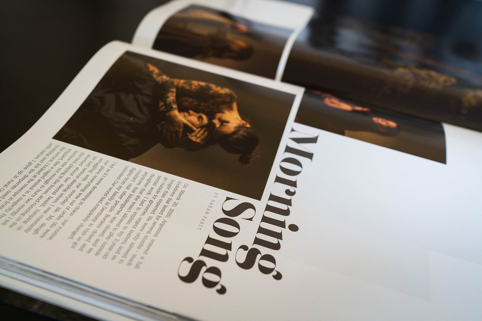
Spread from Morning Song essay by Sarah Pabst.
All images Copyright 2021 Kenneth Jarecke
Your pricing is based on an annual subscription. Can you share some insight into how you arrived at the individual membership of $300/year? Had you finalized your COGS (cost of goods sold) prior to finalizing your membership tiers?
The cost of goods sold is very close to what I estimated. There really weren’t too many surprises on that front. I made a few mistakes of course. I’m 13 ounces over the good rate for international shipping for example. The cost of sea freight and trucking has gone up since our original bid as well.
Here’s the thing that I haven’t talked about… All of the people who’ve already signed on are “Legacy” members. Their membership rate is locked in forever. They will always be at that same $300 fee (for four issues) for as long as they choose to remain members. At some point, probably right before issue two ships, that legacy rate will disappear and our membership fees will increase. Word to the wise. You heard it here first.
With everything you’ve learned about publishing in the past year, what would you do differently with the benefit of hindsight? Any words of wisdom for photographers who want to publish a magazine or photo book?
Surround yourself with amazing people. It doesn’t matter if you’re working on a book by yourself or producing an oversized behemoth filled with the work of dozens of contributors like us. Don’t do it alone. Get help. People want to help. They want to be involved in something special and they’ll help you to accomplish that.
It doesn’t matter if you have a board or directors or just your next door neighbor, make sure they share your passion and have the creative chops to carry their weight. They need to make you better.
Know that you’re going to make mistakes and you have no idea what those mistakes will be. Learn from them. Make new mistakes next time.
Work with the best vendors you can afford. They will save your butt.
Be smart. Don’t undersell yourself or your product. People thought (still think?) a quarterly magazine priced at $300 was crazy. It’s not. The trick is to find those people who agree with you and produce something that exceeds their expectations.
Don’t censor yourself. There’s plenty of people that are willing to do that job for you. Stay true to your vision. It’s the only thing you have that’s truly yours. Nobody knows what you’ve got going on and they won’t know they want it until you show it to them.
Be excellent to one another… okay that’s a Bill and Ted quote, but it’s true. It’s so much easier to be mean, jealous, whatever. Resist that temptation. Empathy is a key ingredient for making lasting images and relationships. Think the best of others and they might surprise you by living up to your expectations.
