Share
The Best Looking Slideshows in Media
You’ve come a long way, Internet. In 1998, the Washington Post published a special report to celebrate the 40th Anniversary of Cuba, which includ...

You’ve come a long way, Internet.
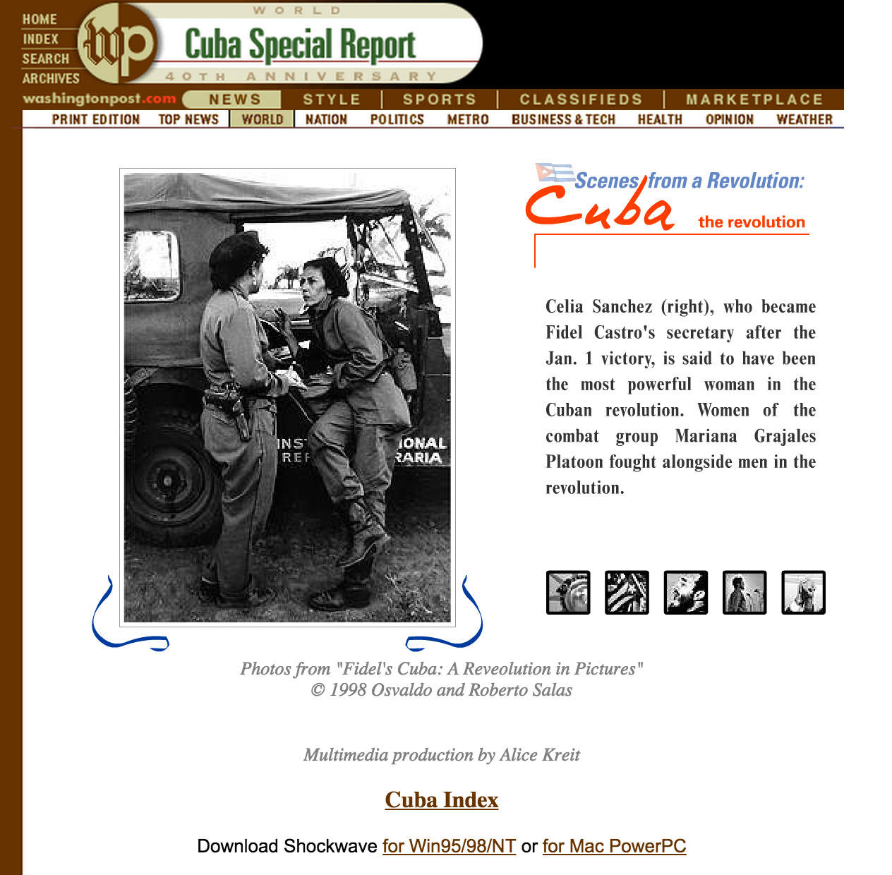
In 1998, the Washington Post published a special report to celebrate the 40th Anniversary of Cuba, which included a multimedia slideshow. The images measured about 325 pixels in length, and the slideshow used an emerging technology from Macromedia called Shockwave (which would later be acquired by Adobe and evolved into Flash).
We didn’t know it then, but photos and video would grow significantly in popularity, and would prove themselves as effective and sticky engagement tools for publishers. As screen sizes increased and technologies like jQuery evolved, so too did the slideshow. Here are some of our favorites.
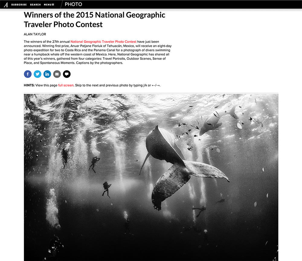
While at Boston.com, Alan Taylor developed The Big Picture, arguably the first large publication to move away from the standard “one image per page” format that dominated slideshows until that point. Taylor advocated for the use of a vertically scrolling page of large images devoid of watermarks and gimmicks that would detract from the glory of the photo. He brought the same sensibility to The Atlantic when he was hired for their In Focus blog. As responsive design evolved, it was no longer necessary for the user to click on the size of photo they wanted displayed. Now the image is automatically resized to fill the viewport, and keyboard mappings allow for simple navigation with the arrow keys.
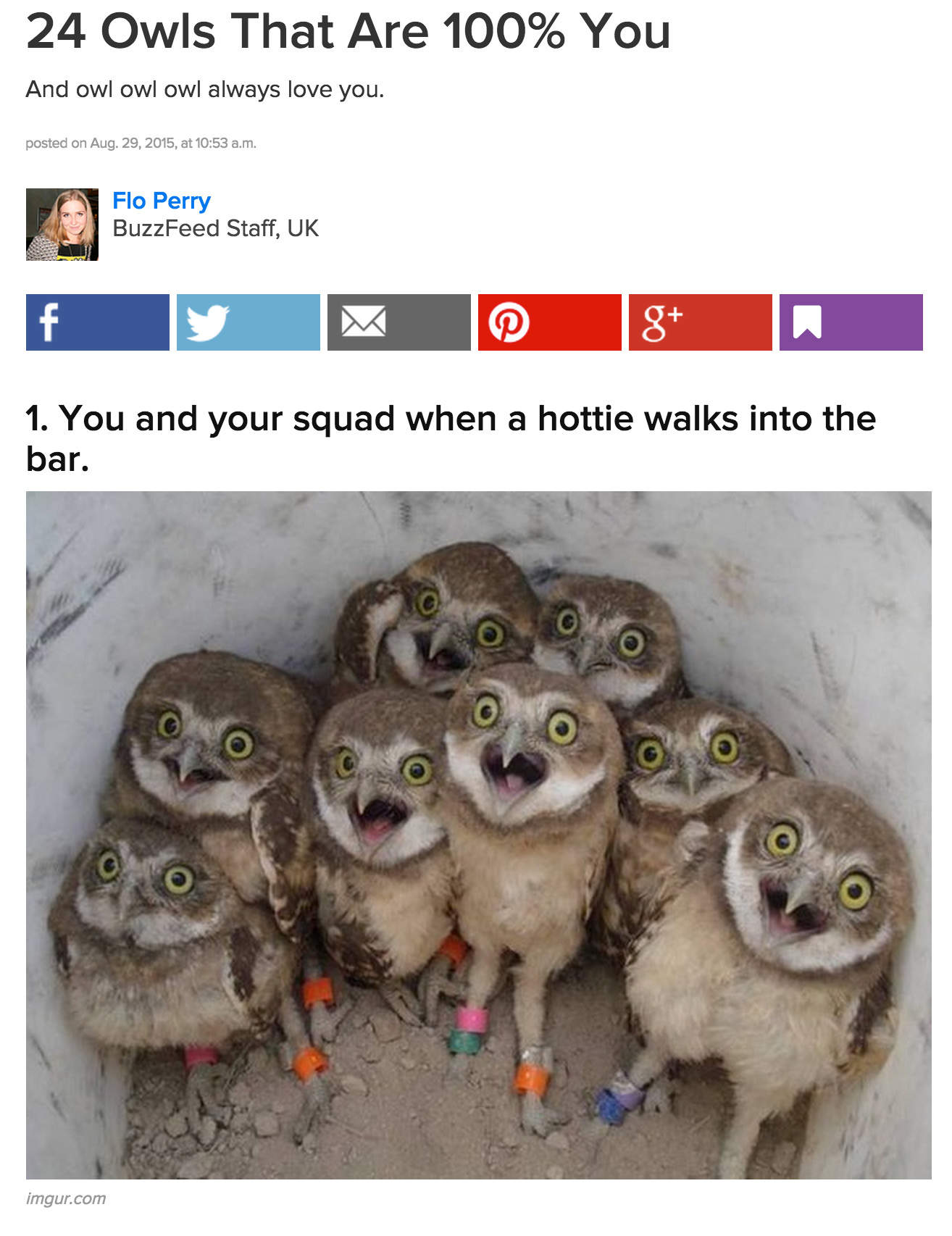
BuzzFeed built an empire on the listicle, that familiar number list form of journalism that has proven virally addictive. Using a vertically scrolling format, the listicle typically uses a “cardinal number in its title,” and each image is numbered and includes a snarky caption above images of questionable provenance. The design of the listicle leaves a little to be desired, but it’s hard to deny their primal appeal.
It might seem counterintuitive for a National Public Radio to be in the slideshow producing business, but in the Internet age, the crossover is crucial for survival. The relatively new “Look at This” format uses a full viewport design and rather than making the caption subordinate to the image, one could argue that the caption uses the image as wallpaper.
The format is engaging, but not perfect. As you advance through the slides, the URL does not change impacting the SEO-ability of the presentation.

The inline slideshow is still alive and well, and the TIME Lightbox does a good job of incorporating a decently sized (and responsive image) with a caption and clear navigation. The user can also opt to go full screen where the images are even larger. A “Share” button is prominently displayed to increase social engagement.
The New York Times “Walking in War’s Path”
Slideshows don’t need to be user controlled, nor do they need to be the tightest edit. Tomas Munita’s Walking in War’s Path uses the hyperlapse convention for photojournalism – giving a sense of place that isn’t possible when only a few images are selected to represent a story. The presentation was engaging and informative, and I loved it.
Panoramic images are problematic to display online. They can be stunning as prints on a wall, but in the online environment they are either reduced to fit a screen, or stretched out in a way that is confusing and distracting to the user. Not so with “The Wait.” Hilary Swift uses a collage technique rather than seamless pan/stitch to create a very long panoramic that is broken up with vignettes of various people depicted in the photo. The scrolling is reminiscent of “If the Moon Were Only 1 Pixel” – the line at the Crotona Park Pool seems as endless as the solar system. “The Wait” isn’t a slideshow in the traditional sense, but it absolutely combines a large number of images to sequentially tell a story, and it does so marvelously.
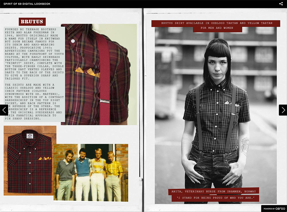
Ceros is a third party system that helps brands develop catalogs, lookbooks, etc without the need for developers or technical staff. Even when video is incorporated, the presentation can still be decidedly slide-like. But unlike the static image that is typical of most media sites, the Ceros slideshow can incorporate animation without using Flash.
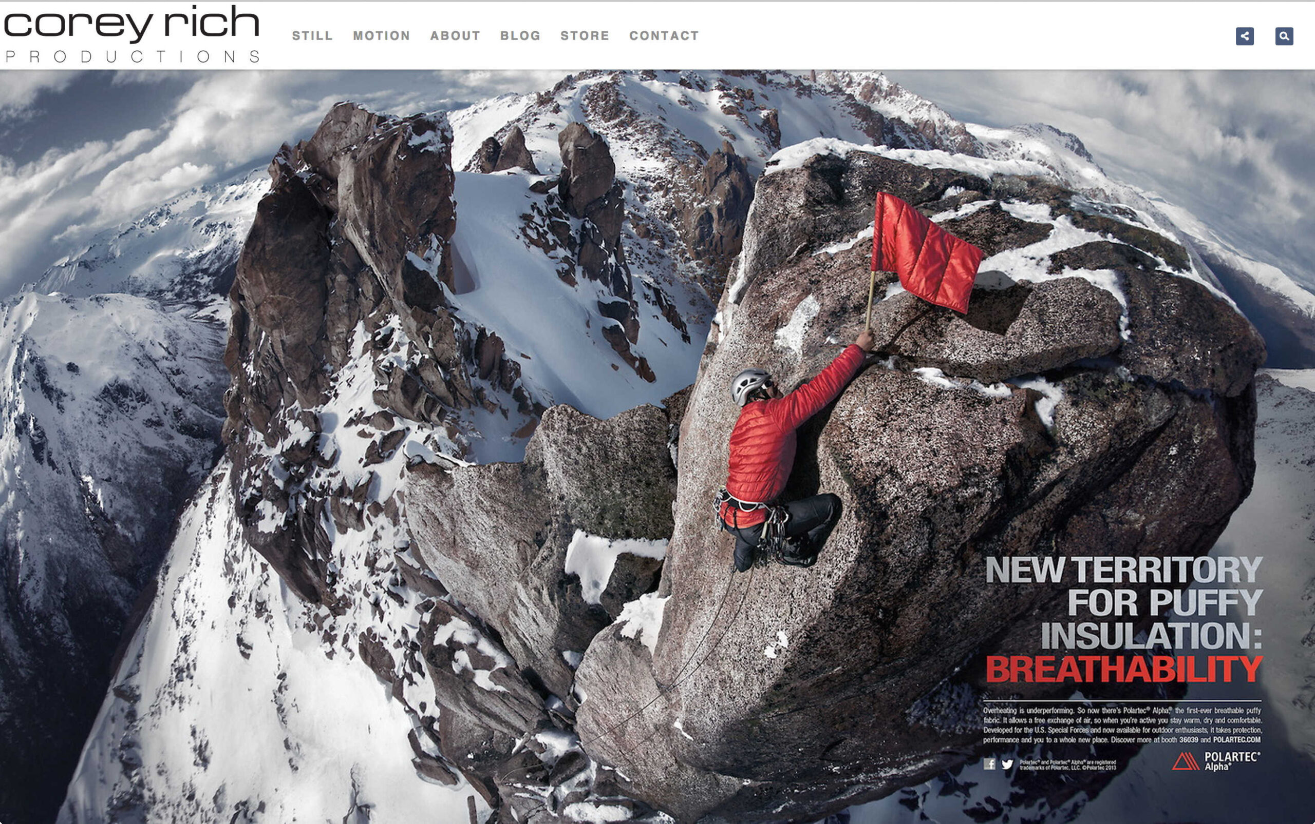
I would be remiss to not mention the PhotoShelter slideshow options that vary by theme. Adventure photographer Corey Rich uses the Promenade theme to display a large image with a lower filmstrip for easy navigation. Full viewport options also exist bringing the same display capabilities of the large media companies to individual photographers.
