Share
Using the Halide Photo App
The photo app Halide received press coverage commensurate with its founders’ pedigrees as former Apple and Twitter employees. Armed with a compe...
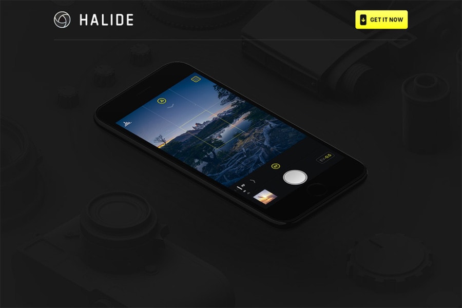
The photo app Halide received press coverage commensurate with its founders’ pedigrees as former Apple and Twitter employees. Armed with a compelling origin story (a trip to Hawai’i where co-founder Ben Sandofsky’s camera fogged up at the base of a waterfall) and effusive testimonials (“it just exudes camera-ness,” said John Gruber on Daring Fireball), the iOS app is marketed as a “premium camera for your phone” touting its “tactile” controls and intuitive user interface. Halide is staking out the middle ground between Apple’s default Camera app and more full-featured apps like Camera+.
I’ve always found the native camera apps on both the iPhone and Pixel to be more than sufficient for most photography, so I was curious to explore Halide’s claims.
Halide allows you to control the following parameters:
- ISO (23 – 1840)
- White balance
- Shutter speed
- Focus
- Exposure value (+/- 6EV)
- RAW/JPG formats
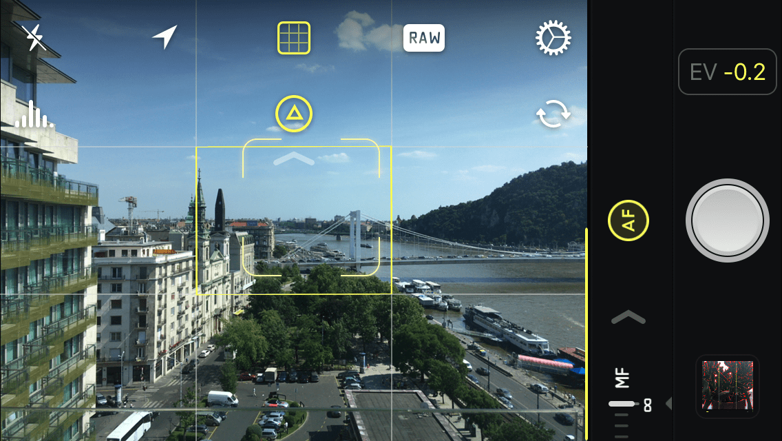
Additionally it provides a histogram, rule of thirds grid lines, and focus peaking controls.
I used the app for a couple days and this is what I found.
Exposure controls aren’t much different
Dragging your finger up and down alters the exposure value – just like it does on the iPhone Camera app. Halide does provide an EV scale so you know how much you are dialing into your photo in 1/10 stop increments. Strangely, there is no simple way to zero out the adjustment (I thought double tapping the EV display might do the trick, but no). Camera has an AE/AF lock function that works pretty well, and tapping on the screen releases it.
Shooting at the base ISO reveals shutter speed limitations
Presumably one reason to override the ISO is to lower it to the base value to increase image quality. But doing so in low light reveals the 1/3s shutter speed limit imposed by the iPhone’s software. Yes, there are other apps that extends this range, but thermal noise makes this a nonsensical solution if IQ is the main justification.
Focus peaking is ok, but without zoom, you can’t really tell what’s sharp
Focus peaking basically uses contrast detection to highlight “sharp” areas of the photo. Dedicated camera hardware that provides focus peaking usually includes a zoom feature because a red outline isn’t exacting enough – particularly on a small screen. Such is the case with Halide.
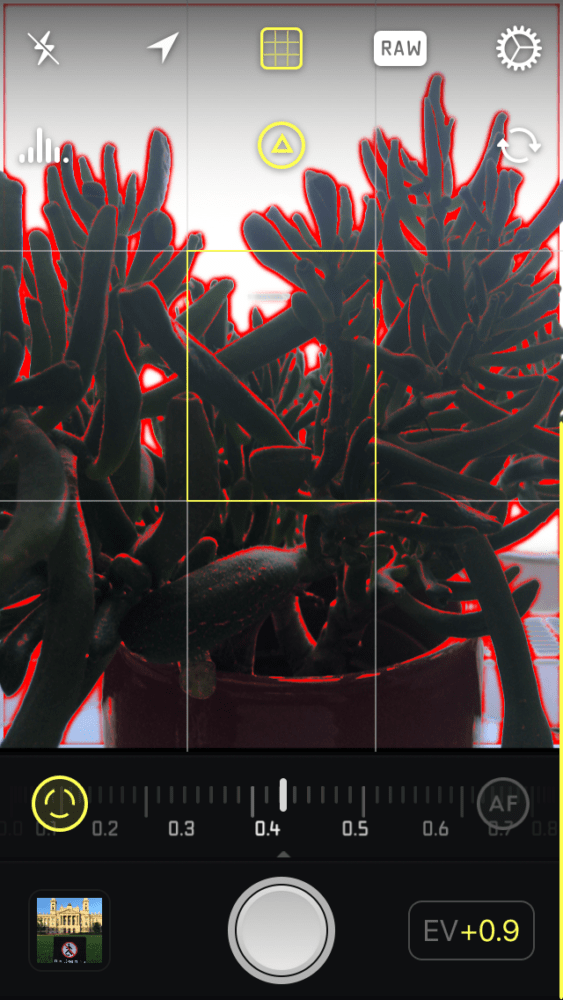
In a high contrast scene, what is sharp?
RAW is nice, but huge files on a phone is not so nice
Cameras support removable media with capacities that regularly exceed that of even the latest smartphones, so shooting RAW is rarely a “decision.” On a phone, however, the file sizes can add up quickly, and people seem to always be juggling which content to delete from their phones (music, videos, photos, etc). The punchy JPGs of the iPhone combined with editing controls in apps like Photo or Instagram provide a native workflow that makes me question the value of smartphone RAWs.

RAW capture in Halide, edited to taste in Lightroom.
Manual focus eliminates hunting but…
I have definitely encountered situations where the camera hunts back and forth and you can never seem to lock focus on a subject. Using Halide in MF mode allows you to avoid this problem. But when you’re shooting something so close that requires a locked focus, you probably want to be on a tripod since even the subtle motion of your hand can affect sharpness.
For most situations, switching into MF mode is much more complicated that tapping to focus.
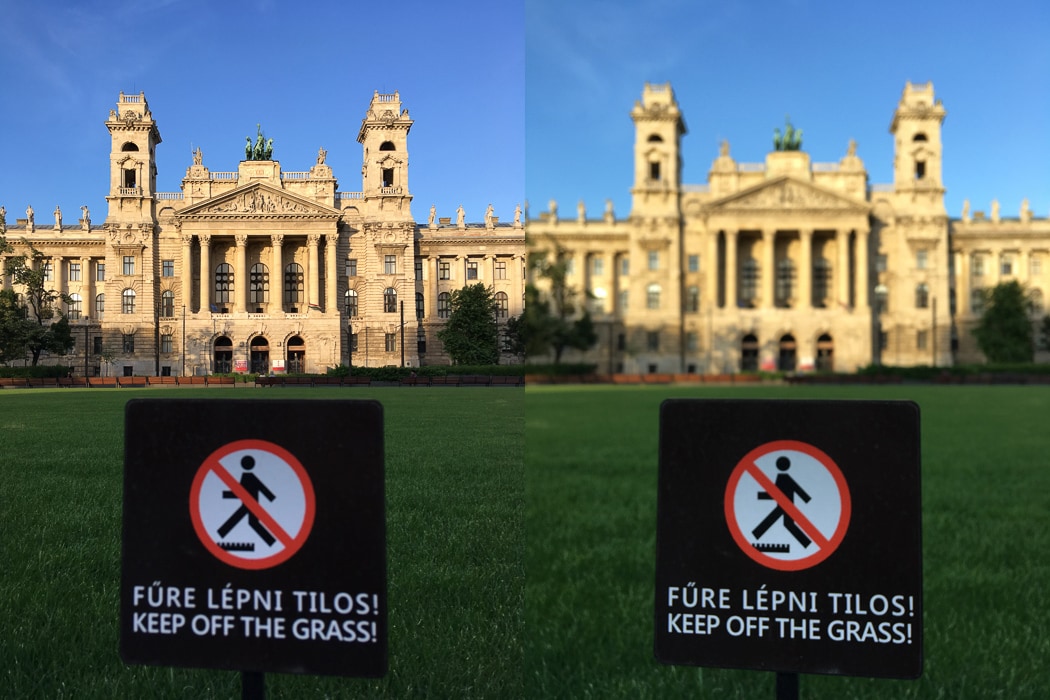
Can you tell I manually focused? Exactly.
Artificial horizon/leveler is great
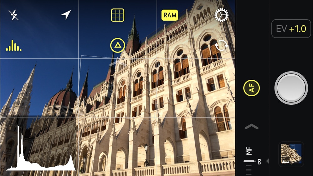
Most cameras use an artificial horizon similar to something you might find in an airplane to level your photos. I’ve always found them to be a bit quirky. When gridlines are enabled in Halide, a rectangle appears to help you level your photo – it feels much more sensitive and intuitive to use.
Conclusion
The iPhone’s popularity as a camera resulted from simplicity combined with the app infrastructure. It enhanced point-and-shoot photography and instantaneous sharing with minimal friction.
Halide looks nice, but it didn’t elevate my picture taking. Adding creative controls into the software seems like a laudable goal, but calling your app “tactile” doesn’t resolve the fact that gesture based controls are not always suitable replacements for physical dials, and they certainly don’t address the physical limitations of the phone (e.g. small sensor, low ISO range, etc). People who regularly fiddle with apertures and exposure are the types of people who buy dedicated camera hardware. The other 95% use smartphones for the point-and-shoot ease.
Modern smartphones take incredible photos with sufficient light. In those situations the beauty of native smartphone camera software is its simplicity. Halide might be “beautiful,” but it solves no problems. It doesn’t make picture taking or sharing any easier, nor does it add functionality that doesn’t already exist. Love the custom typeface, but I’m sticking with the natives.
