Share
Children’s Aid: How a 168-Year Old NY Nonprofit Evolved
PhotoShelter enables Children’s Aid to modernize and reintroduce its brand.

If you grew up in the tristate area, chances are you remember this ’80s jingle, “I’m really glad they made the Children’s Aid Society,” which ranked right alongside Carvel’s Fudgie the Whale and ‘588-2300 Empire’ in a Buzzfeed walk down memory lane.
In 1853, Charles Loring Brace founded the organization called “The Children’s Aid Society” to help poor and orphaned children living in the streets of New York City and over the past 168 years, the organization has evolved with the times. To this day, the organization is a leader in providing human services in New York City.
The Situation
Rebranding an organization with 168 years of history and 100 different programs is no easy task.
In 2017 the brand reintroduced itself to the nation with an updated identity. The Children’s Aid Society became Children’s Aid, they launched a modernized logo and gave their content a refreshing look and feel.
“It was time to make sure that our public profile was really in lockstep with the programmatic work that we were doing,” says Patrick Egan, Director of Marketing and Communications for Children’s Aid.
First, Patrick and his team worked with a communications firm that specializes in cause marketing to survey employees, government officials and the families they serve.
“We are an organization that means different things to different people,” explains Patrick. “Some people may know us as a foster care organization, another family might know us because their three year old is going to one of our classes.”

They spent nine months getting an understanding of what the organization represents to their stakeholders and crafting a new brand based on their research.
The Solution
“The next step was really creating the proper platform to introduce us, and we knew we needed a 21st century website,” says Patrick.
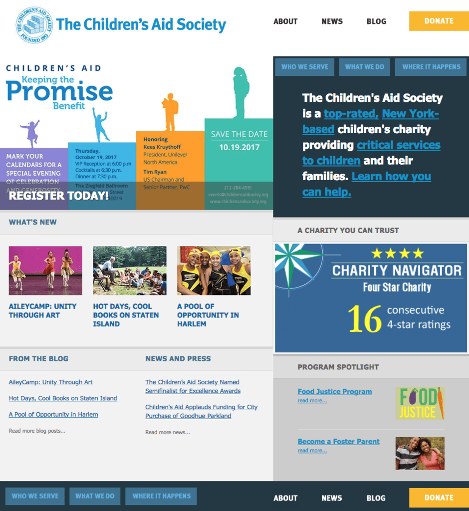
Here’s what the website looked like before they began working on it—an outdated, text-heavy format and a logo that Patrick says was drawn up in the ’70s!

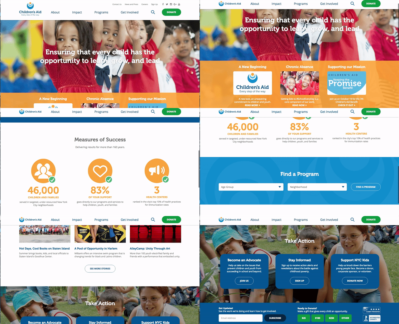
Now the updated website is easier to use and features a vibrant, colorful logo and tons of images illustrating the organization’s impact:

Patrick says the ability to highlight their best visual assets – photos and videos of kids participating in Children’s Aid services – was a crucial point of focus for the new website.
“The writing and the narrative of a story is certainly important, but I know that the visual aspect is really what’s grabbing people’s attention,” says Patrick. “With our social media posts, the ones that have great visuals are the ones that have great traction. It’s crucial to how we tell stories.”
Patrick says visual storytelling is especially important when you offer 100 different programs.
“The way that you change child poverty is not through one single thing – it’s to be with that kid every step of the way. But that does present a really significant storytelling challenge,” he says. “We want to be able to use visual elements especially to make sure that message is broadcast. PhotoShelter has been great to be able to organize our photo and video assets in a way that we’ve never done before, and it’s also been incredibly important in sharing those assets.”
Patrick and his team use PhotoShelter for Brands to store their asset archive and upload new photos; acting as a central hub for image research to power their new storytelling platform.
“The old website that we had – to do a photo gallery was terrible,” says Patrick. “We have all this functionality at our hands now, and we have a digital asset management system that’s really going to help us use it to the best of our ability.”

Plus, easy access to visual assets allows the Children’s Aid team to tell stories in a new, more creative way.
“Someone emailed us and said they were putting together a donors presentation, and they literally said, ‘do you have a picture of kids in a classroom raising their hands?’” says Patrick.
“We know that these kind of requests are going to come to us, and if everybody knows that we have that ability of finding a picture of kids in a classroom, or kids cooking a meal, then that helps them envision what they want. And the system allows us to do it quickly and efficiently overall.”
He adds that streamlining the team’s workflow will have a powerful ripple effect for donors and community members.
“We want our stories to be more substantive. We want to be able to tell people what the organization is in a detailed way that we haven’t before, so they can understand the impact that we’re having,” says Patrick. “They want to understand why they should keep investing in us.”
In the end, Patrick explains that all the changes they’re making now will help Children’s Aid’s mission and services remain the same strong force for good in New York City for years to come.
“The work that we do is still the same, it’s just that our look and our feel of how we talk about our work has changed,” says Patrick. “If we want to be around for another 160 years, we need people to be able to understand what we do.”


